How to use composition to create visually powerful narratives
Analyzing the composition of 2 children's books.
Studying composition is essential for anyone who wants to illustrate children’s books — like me. Through composition, we can create movement, convey emotions, show whether a place is big, far away, inhospitable, cold, full of elements, or empty. The composition speaks to the reader long before the words do.
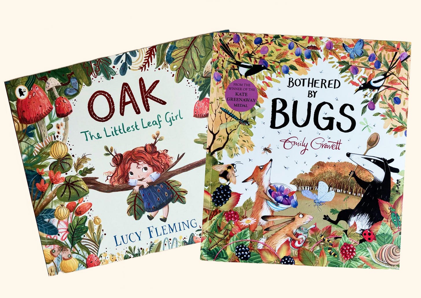
So today I decided to bring something different to the newsletter. Let’s analyze the composition of the illustrations from two books I found at the bookstore recently and couldn’t resist buying.
I was already familiar with Lucy’s work—I love the way she illustrates and I adore her stories. As for Emily, this is the first time I’ve seen her work, but I was captivated by how she composed the illustrations for this book.
Book 1: Bothered by Bugs - Emily Gravett
1. Introducing characters through composition
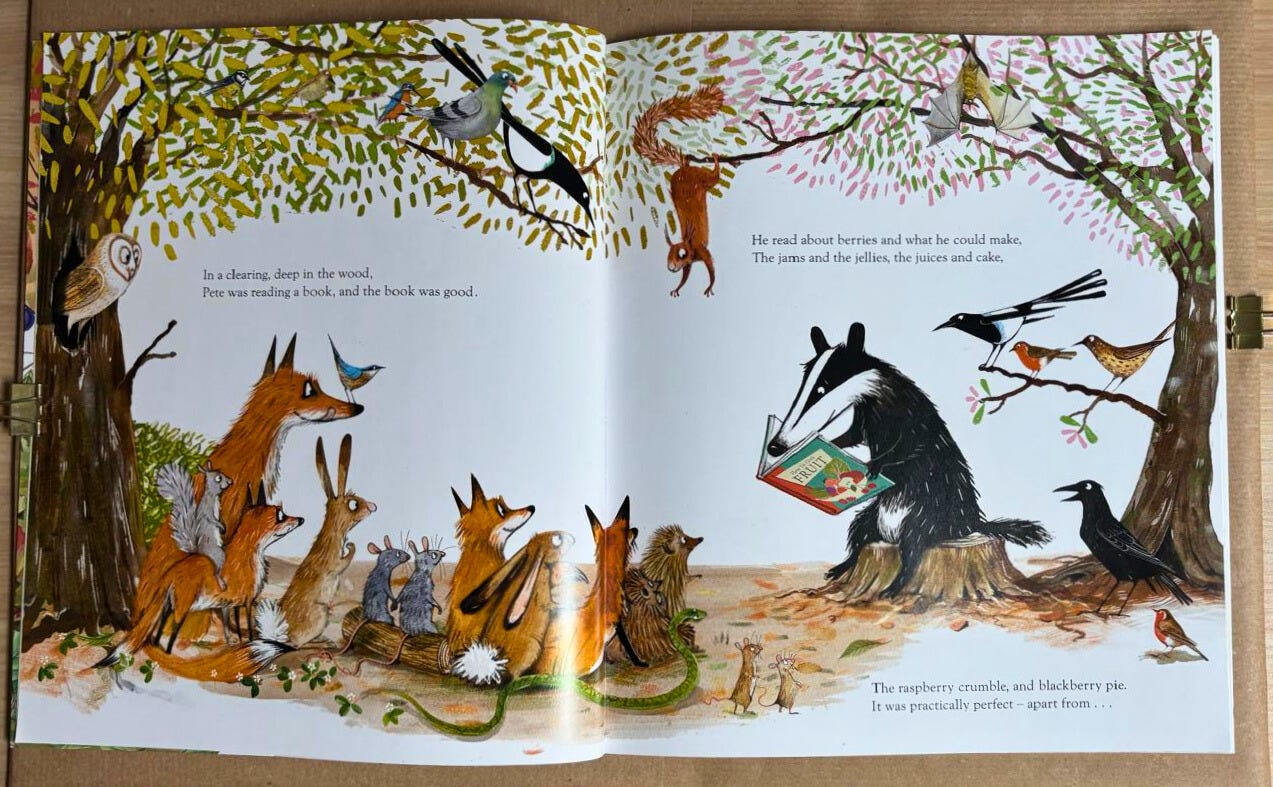
Right on the first spread we are introduced to half of the book’s characters. Through composition alone, we can see that there is a central figure: the badger, since all the other animals are paying attention to him.
According to the text, they are in a clearing in the forest, which is well represented by the composition of trees and foliage. To make the scene more dynamic, the tree on the right is tilted, which also provides a branch where birds can perch.
There is no vegetation behind the characters. I’m not sure what the artist’s reasoning was, but I assume that with so many characters, adding vegetation would make the illustration overcrowded. Besides, leaving it empty allowed the text to fit comfortably.
2. Intentional overcrowding
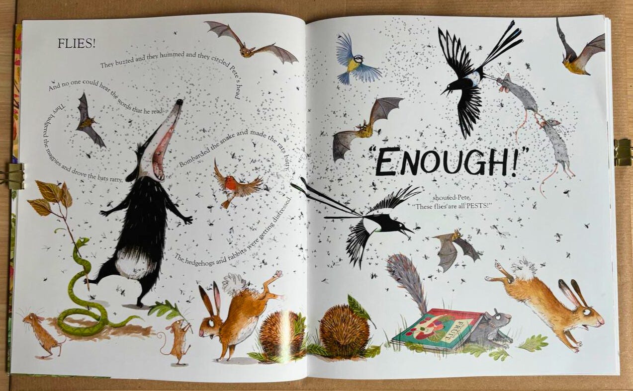
Now we see the moment when the central problem of the story is introduced. The idea here is to make the page intentionally overcrowded, which is why we see so many flies buzzing around.
Looking more closely at the flies, we see that they are not as disorganized as they seem. They are grouped, with spaces between them, and there are larger and smaller flies to show how near or far they are, and also to bring more variety.
For instance, imagine if all the flies were the same size—it wouldn’t be nearly as interesting, right?
Emily also plays with the text itself, making it curve so we get the feeling that we’re reading in the middle of the flies, and using the word ENOUGH in large capital letters to show that it’s a shout.
3. Flow and direction
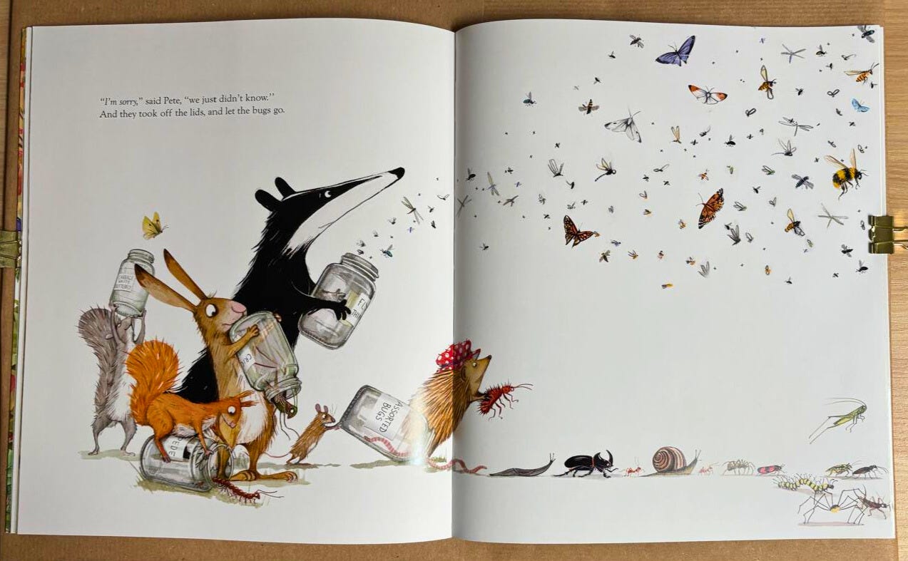
This page is interesting because of the direction in which the insects are being released. They could have been released in another direction—upwards or to the left, for example. But do you know why they are flying to the right?
Because that’s the direction in which the story continues. It makes us want to turn the page to see what happens to them.
4. Spots for multiple small actions
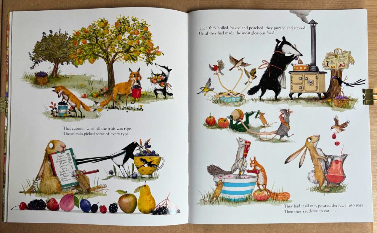
This is a very common type of page in children’s books when many small actions are happening at once, or when we want to show something that happened without needing several double spreads (an illustration that spans two pages).
Here, in this case, there are many actions happening simultaneously, so there are multiple small illustrations interspersed with text. These small illustrations are technically known as spots.
But some illustrators prefer to use vignettes (illustrations with faded or loose edges). I believe that the use of spots or vignettes depends a lot on the personal taste of each illustrator.
Book 2: Oak, The Littlest Leaf Girl - Lucy Fleming
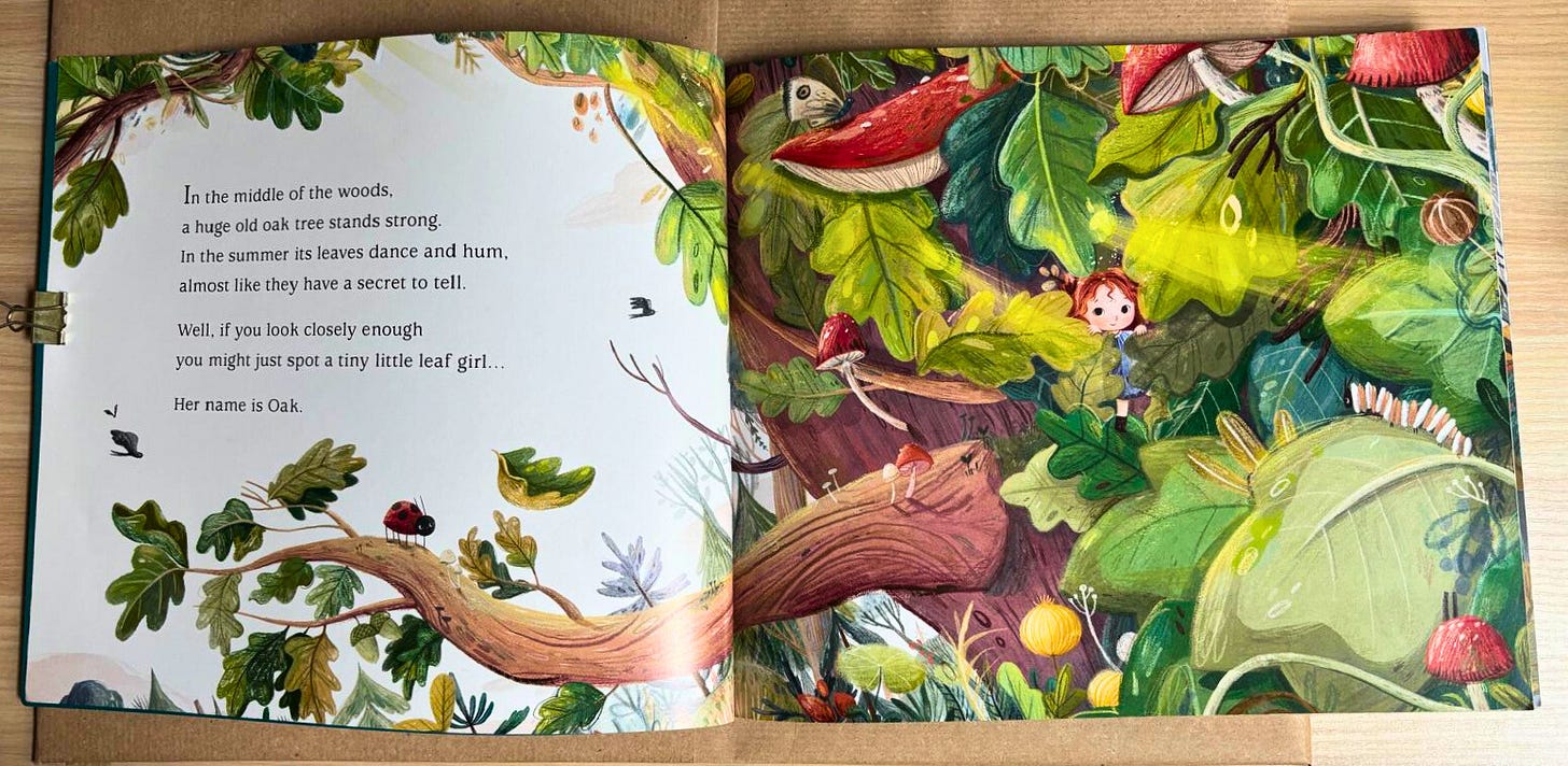
1. Playing hide and seek
In this double spread, we are introduced to the main character of the story, Oak. Notice how the illustrator leaves space for the text on the left page, making it very prominent—this causes us to look there first.
And when we look at the right page, it’s full of elements like leaves, insects, and mushrooms, making us really search for the character. We can also already sense how small Oak is.
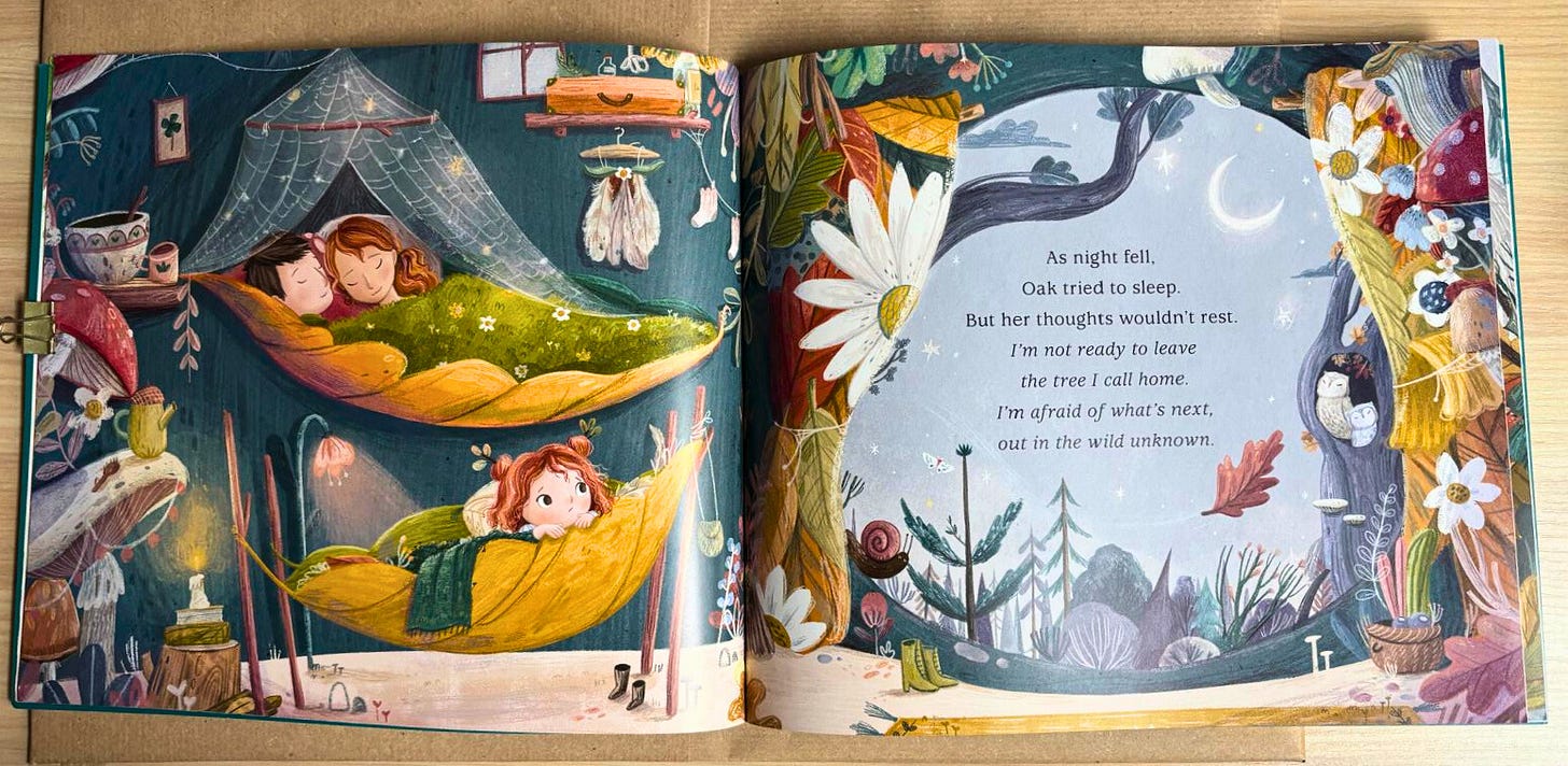
2. Guiding the eye and building atmosphere
The composition guides our eyes from the parents and the character to the outside of the tree — from left to right (the natural reading direction in Western cultures). In addition, the composition creates a frame for the text.
Going a bit beyond composition, we can notice that the colors inside the house are warm and cozy, compared to the outside, which feels cold and mysterious—representing the unknown. This feeling is reinforced by the character’s frightened expression.
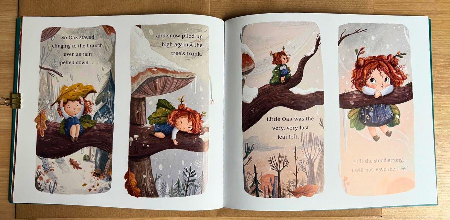
3. Signaling the passage of time
This page is divided into four rectangular illustrations, indicating the passage of time in the story.
In this case, it seems to represent a few days. But I’ve seen books that use the same resource to show time passing within a single day, changing where the character is or the lighting at each time.
I find this resource very interesting because we can also use it for longer passages of time, such as between seasons or over several days. Of course, if a lot happens during that period, it would be more interesting to create double spreads instead. But in this story, it’s meant to show something brief—the focus is on what happens before and after this time shift.
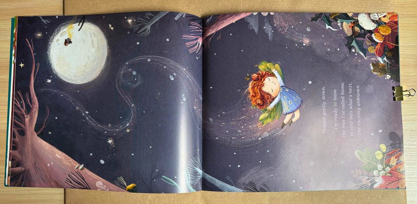
4. A dramatic vertical composition
I personally loved this page and how it breaks the reading orientation we’ve become used to in the book. Since the idea here is to show how tall the tree is and, consequently, how long the character’s flight is, this change in orientation makes perfect sense.
The angle of the illustration’s composition—where we see the tree from below—shows how enormous it is. And because the illustrator drew the character’s flight path, we can see that it was a fun fall, perhaps filled with emotion, but judging by her expression, she is enjoying it.
Because the scene takes place at night, it also feels more magical. And the night sky can be filled with stars and the moon. And if you are already familiar with Lucy’s work, you know there is always an easter egg: a character from another book appears on the moon.
I hope you enjoyed this compositional analysis of these two books. If you’d like, I can make more texts like this about the composition in children’s books.
By the way, give me suggestions of children’s books you really like—either because of the story or because of the illustrations. I’d love to discover new books.
See you in the next newsletter.
Charlene ⭐


Thank you so much for sharing these, Charlene! I was not familiar with either one and the compositions are lovely. Are you familiar with Pokko and the Drum by Matthew Forsythe? The illustrations are terrific and the compositions are amazing. It’s one of my (many, who can choose?) favorites.